
Do you consider yourself a part of any group or trend in art?
KRIS: Well we certainly didn’t set out to do that but we’re certainly noticing trends in the queer art market. Before it was sort of a niche thing and now, with everyone being able to show their work online, we get a lot more attention. We notice trends within our Instagram culture where queer art seems a lot more visible.
ANDY: I think along with the visibility is the accessibility. So a lot of people who we’ve made friends with like Adam Chuck and Hey Rooney, they are making art and putting it out there and our target isn’t necessarily just art collectors. It’s really everybody.
Are there other artists that you guys reference or think about while making your work?
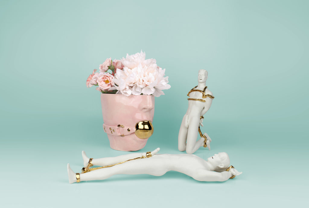
KRIS Well we’ve always been inspired by 50s and 60s housewares and the pastel color palettes. But it’s also that these items are beautiful but also utilitarian. So we’re thinking a lot about that when we create a lot of our work. So we have vases that are really beautiful but you also put flowers in them.
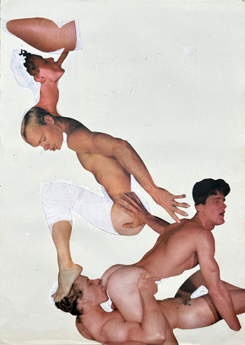
ANDY: We also try to work within the history of ceramics so like Dev Porcelain and Meissen Porcelain. So this 17th century over decadent aesthetic but making that within our brand of super homo erotic figures and elements of queer culture.
More recently we’ve been looking at Greek pottery and trying to use our figures and characters in that sort of way while blending it with more contemporary colors and styles.

So what about the queer aspects?
KRIS: We’re all all about visibility and I think now more than ever it’s important to display your queerness. You have to be kind of forward with lifestyle.
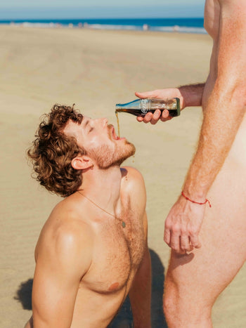
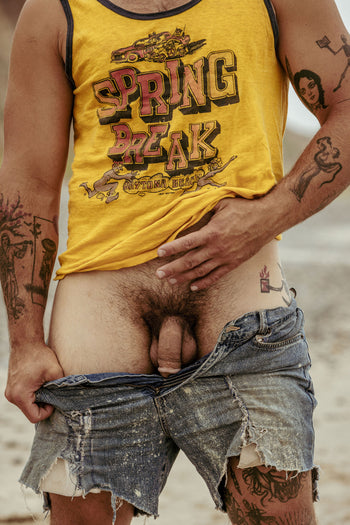
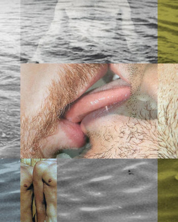
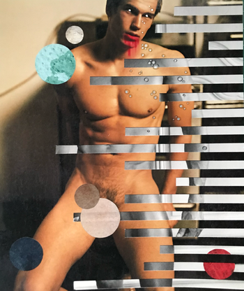
ANDY: But it’s also just thinks like camp aesthetic so like using pink flamingos referencing John wAters and we work a lot with The Queen and things that are just in popular queer culture and vernacular. We just try to incorporate all of that into what we do.
So there’s the two aspects of queerness of this one camp aspects in your work but then there’s also the work with the figures engaged in some sort of homo erotic positiosn and so I wanted to hear a little bit about that balance.
ANDY: Well initially we started using the figures with fruits and so we were taking the sexuality and making it fit into a campy, 50s, knick knack aesthetic. So like we would be inspired by little strawberry pepper shakers but then doing that in our own way. So we started taking the figures further, more along the lines of like Olympian ceramics and having that really sexual but beautiful aesthetic where they are statues but still a part of the everyday. That’s something we took from Greek pottery is that it was something that was very functional but had these really erotically charged images with taboo subjects. I thought that was something we could do an emulate.


From my perception the commercialization of queer culture has historically been generally been that camp part and not the actual sexuality. From what I am seeing increasingly, now queer creatives are commodifying the sexuality.
BOTH: For sure, totally.
KRIS I think not so long ago, it was seen as ok to be gay but as long as straight people didn't have to think about the actual sex act. So like someone like Liberace was one of the world’s biggest entertainers and he was easy to digest because he was sort of this guy who wore fur but was otherwise neutral. He didn’t speak about his relationships or sex life.
ANDY: But at the other end you have artists like Robert Mapplethorpe who used sexuality in ways that was very shocking to people. We try to blend the two. I think other people are doing that too where people are seeing it not as shocking but as beauty now.
For sure, I definitely think it’s a trend that sort of where before it might have been portrayed as a spectacle now artists are portraying it as something organic and simply beautiful. Like it’s just as natural as this strawberry.
ANDY: I love that analogy.
KRIS: For us, the work we create is normal. It may shock some people but we hope that queer culture is somehow normalized by us.
ANDY: We actually get a lot of men that come up to us saying that they love it. They sort of say they’ve never seen men sexualixed in this way.

So you can tell me about some artists you all are interested in?
ANDY Well we really love the Haas brothers. They are really inspiring to us. There are so many great potters out there and we hope to be working in the same vein but we don’t know if we are yet. But also historically like David Hockney, Andy Warhol and a lot of the sort of cliche ones. Wayne Thibeaud is one of our favorite painters, he was working primarily in the 50s and he did a lot of serene looking food. We really love his color palette.
As far as current artists, we just have so many favorites and most of them are on Instagram.
So other than the camp aspect, does the color palette have another function?
KRIS: Yes. It really helps when we do some sort of shocking piece. So say our figures are in some sort of fisting arrangement, if you put those in like soft glossy colors, the act is not the first thing people say. It’s something you can appreciate as a beautiful object and then you realize what is happening there.
ANDY: I know that when patients are sick in the hospital they paint the walls a creamy yellow color because it’s supposed to be soothing and calming. So a lot of our ideas might be crazy and in your face but if you marry it with a pastel, it somehow makes it less crazy and beautiful.
